My Data Warehouse Project Presentation - Azure
Kindly wait a few seconds for the video to load . . .
Scroll down to view my Power BI dashboards.
My Data Visualizations
Executive Summary Dashboard
Using a sample dataset, I created visualizations for a dummy organization named, Vidya’s Corp. The below dashboard gives an overall summary of total orders, revenue, returns of Vidya’s Corp.
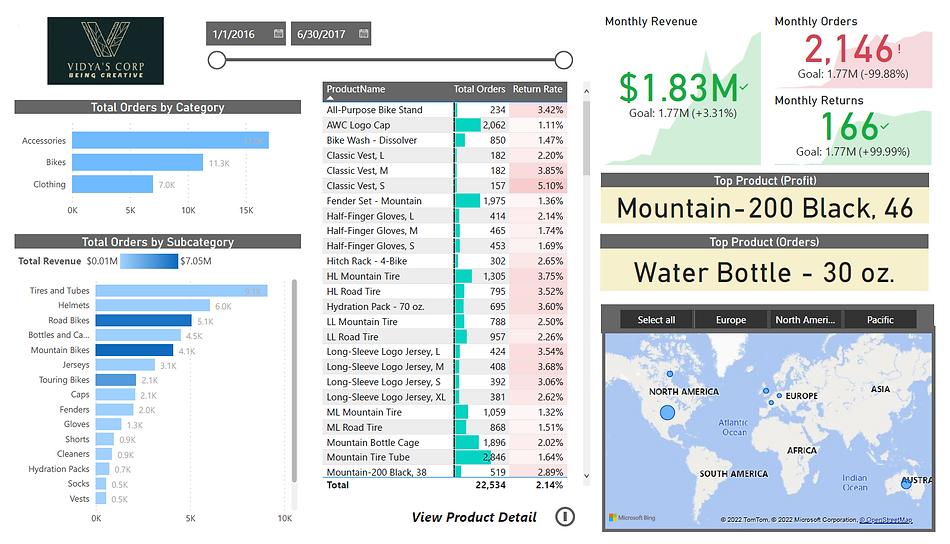
Product Details Dashboard
This dashboard gives information on each product, its weekly profit, number of returns of the product, current month orders and targets and return rates compared to previous months.
Customer Details Dashboard
This dashboard gives information on each customer, broken down by gender, income level , occupation and age. It gives useful information on total orders and revenue by each customer.


Analyzing customer churn data - using dark mode in Power BI


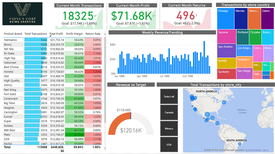
Topline Performance Dashboard
This dashboard is created with a different dataset. Provides overall information on transactions, profits and returns, along with different store locations listed by transactions which can be drilled up to countries and drilled down to states and further down to cities.
Importance of highlighting only necessary information
From various data visualizations samples that I observed and with insights from professors, I got to know that highlighting important details to audience is a very important part of data visualization. The audience need to know where to look at in a chart or bar graph. With that in mind I created a visualization about usage of Social media to highlight which age group of users use social media the most over the years.
